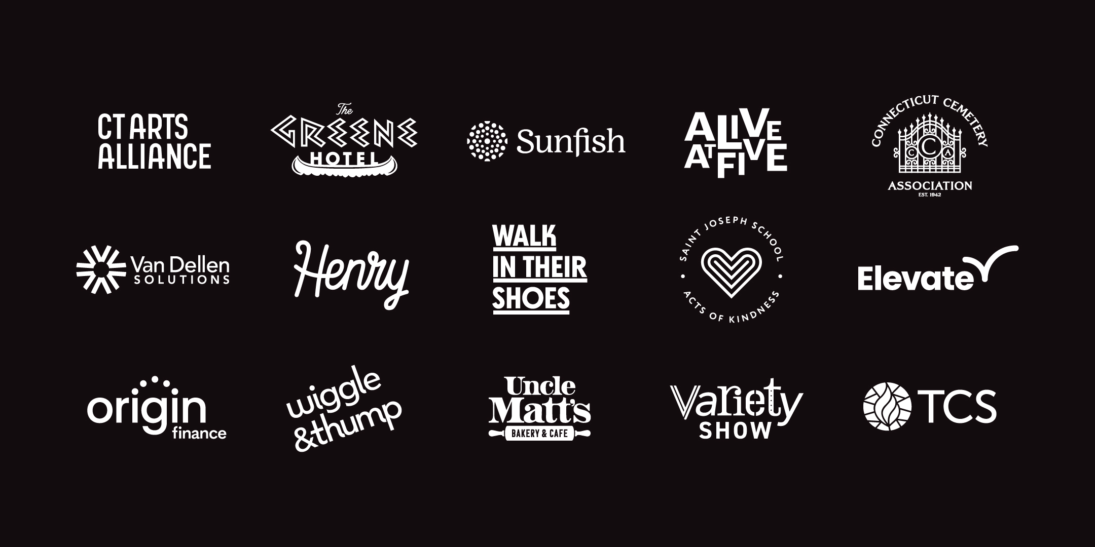
There are always going to be trends in design, some of which even we're not immune to the temptation of trying. But when it comes to logo design, we have a few simple rules. No matter if it's simple and bold or intricate and elegant, hand-written or typeset, serif or sans-serif, word mark or iconographic, we work to keep each solution: 1. Legible, 2. Appropriate, and 3. Timeless. Legibility is the main reason we still ensure each logo works in 1-color, in both black and knockout variations. And it has to work really really small. In this post, we're showing a few examples from the past two years to help illustrate this point. Appropriate means that we employ the right visual tone of voice to convey brand values. Last, if our solution isn't timeless, we're detracting from the long-term Return on Investment that our clients hire us for.
Your subscription could not be saved. Please try again.
Thanks for subscribing!
The Studio
Have an interesting idea or project in mind? Let us pour the coffee.
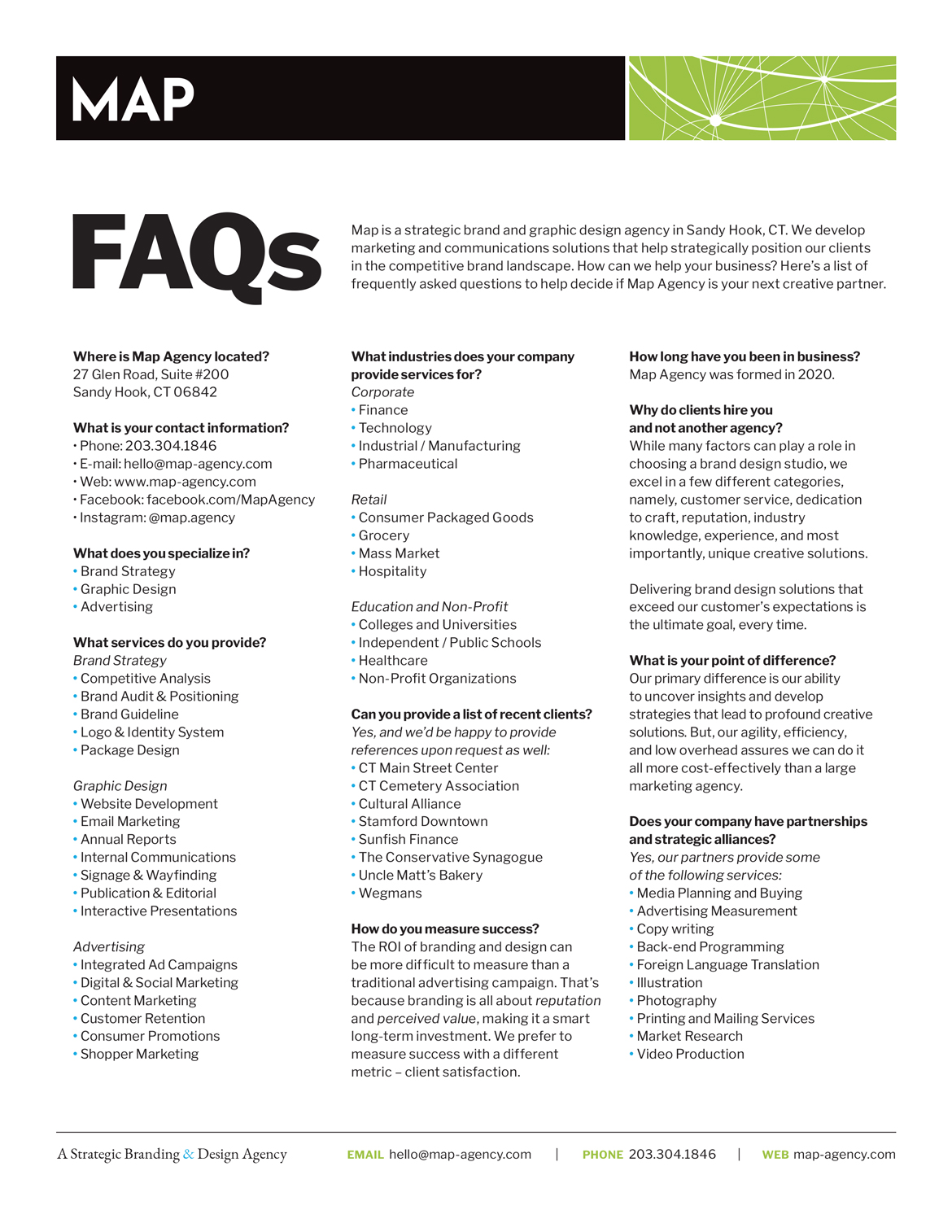
Map Agency
27 Glen Road, Suite #200
Sandy Hook, CT 06482
Let's Connect
Send a letter, give us a ring, or follow us on social.
Phone: +203.304.1846
Email: hello@map-agency.com